
Curo

A fast and intuitive app to convert and track currencies, crypto, and metals.
Available on the App Store
My Role
UI/UX Design
Interaction Design
Motion Design
Visual Design
Team
UI/UX Designer
Developer
Tools Used
Figma
Adobe After Effects
Adobe Illustrator
Timeline
6 weeks
The Problem
How might we simplify currency conversion while keeping exchange rate data clear and accessible?
Many currency conversion apps feel cluttered and difficult to navigate, especially when handling multiple asset types like crypto and metals. Curo was designed to create a faster and more intuitive experience focused on clarity, readability, and seamless interactions. Alongside quick conversions, the app also allows users to browse live exchange rates in a more organized and accessible way.
Key Insights
Users prioritize speed and readability when converting currencies
Financial apps often feel visually overwhelming
Browsing exchange rates should feel separate from conversion tasks
User Flow
The following flows highlight the app’s primary interactions for conversion and exchange rate browsing.
Convert Currency
.png)
Browse Exchange Rates

Wireframes
Wireframes were used to explore screen hierarchy, streamline interactions, and create a more intuitive flow between key features.
.png)
Brand & Motion
Onboarding Animation
Animations were used during onboarding to introduce the product in a more engaging way while supporting brand identity and creating a stronger first impression.


Logo
.png)
Inspired by origami, the app logo was designed to represent flexibility and constant change. Orange acts as the primary brand color, while accent variations extend personalization across the experience.
Key Interactions
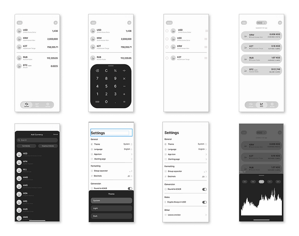
Convert Currency
Reducing friction through fast and familiar interactions
The conversion flow was designed to keep calculations accessible without interrupting the main interface.

Browse Exchange Rates
Making financial data easier to browse and compare
Exchange rates were separated from conversions to create a clearer experience for browsing trends, comparing values, and exploring historical changes over time.

Personalization
Adapting the experience through themes and accent colors
Customization options allow users to personalize themes, accent colors, and default screens while maintaining consistency across the interface.

Reflections
Designing beyond visual polish
Building Curo reinforced the importance of balancing aesthetics with usability. Financial tools often prioritize information density, while this project explored clarity through simplification and motion.
Future improvements
If revisited, I would further explore accessibility considerations, expanded data visualizations, and user testing to validate interaction decisions.